
Tips And Rules For Button Design
Buttons are a crucial element for an interactive design. These buttons are important in the conversation between the user and the system. In this article, we’ll take a look at the basics, rules, and tips you need to know to create practical buttons.
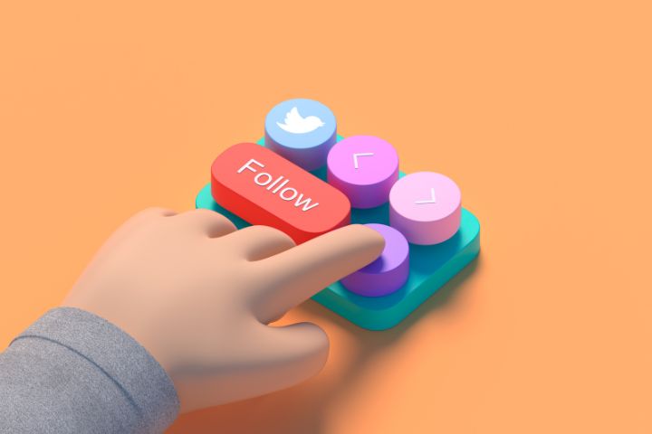
Buttons should look like buttons.
When it comes to interacting with the user interface (UI), it’s essential that users immediately know what they can and can’t click. Each element of the design requires an effort on the part of the user to understand it. In general, the longer it takes for the user to understand the user interface, the less useful it becomes to the user.
How do users understand if a certain element is interactive or not? This is based on previous experience and visual cues to understand the purpose of the UI object. Therefore, it is very important to use appropriate visual cues (colour, shape, size, etc.) that make the element feel like a button. Visual cues contain essential information. These help structure the user interface.
Unfortunately, in many designs, the indications that a button is interactive are weak. This requires effort on the user’s part, which reduces the effectiveness of the button.
If users need help understanding what they can and can’t click on, it doesn’t matter how beautiful the design looks. When the user interface is difficult to use, this will lead to frustration for the user and the button will not be effective.
Mobile users
Weak indicators are an even bigger problem for mobile users. To understand whether an element is interactive, desktop users can use a cursor. If the element changes state, it will probably be a button. Mobile users cannot use this. To understand if an element is interactive, users must click on something. There is no other way to check if a component is interactive on mobile.
Don’t assume a UI element is clear.
In many cases, designers deliberately do not identify a button as an interactive element, assuming it should be obvious. When designing a user interface, you should always keep the following rule in mind:
A designer’s ability to identify an interactive element designation differs from a user’s. As a designer, you know what each design element should do.
Use familiar designs
Here are some examples of buttons that are familiar to most users:
- Filled button with square edges
- A loaded button with round edges.
- A button full of shadow.
- ghost button
Of the four examples, the “Shadow Filled Button” design is the most obvious to your users. When a user sees this dimension of the button, they will immediately understand that this element can be pressed.
Don’t forget the white space.
Not only the visual appearance of the button is important. The amount of white space can determine whether it is easier or more difficult to understand if it is an interactive element.
Place buttons where expected
Buttons should be placed where the user can easily find or expect them. Don’t let users start a search to find a button. If users can’t find the button, it’s likely that the user simply doesn’t know that a button exists.
Use traditional layouts and standard UI patterns as much as possible
The usual location of your buttons will help you find them. With a standard layout, users will easily understand the purpose of each element. This even applies to a button without strong labels. Combining a standard layout with a clear visual layout and enough white space will make the layout understandable.
Tip: Test your design to see if it can be found. When a user first navigates through a page containing buttons, they should be easy to find.
Tells what a button does
Buttons with a generic or misleading label can cause a lot of frustration for the user. When writing a button label, clearly state what each button does. Ideally, each button’s label should state exactly what it does.
Users need to know exactly what happens when they click a button. Let’s see this with an example. Suppose you accidentally click on something that deletes everything, and you see an error. This error asks you if you want to delete the following items with the “OK” and “Cancel” buttons. In this case, It is unclear what “Accept” or “Cancel” represents. Many users will wonder what happens when they press “Cancel”.
Instead of using “OK”, it is better to use “Delete”. This clearly indicates what this button does. You can use a red colour to indicate even more clearly that this is a potentially dangerous action.
Use a good size for the buttons
The size of a button should reflect the importance of this element on the screen. A big button means the action is important.
Prioritize certain buttons
Make the most important button really seem like the most important one. Always try to make the main action button prominent. This can be done by changing the size and using a different colour. This will draw the user’s attention.
Make the buttons finger-friendly for mobile devices.
In many mobile applications, the buttons need to be bigger. This often leads to a user clicking on the wrong button.
A recent study has found that a good minimum touch size is 10mm x 10mm.
Keep in mind the order
The order of the buttons should reflect the natural conversation between the user and the system. Ask yourself what order users expect on a screen and adjust the layout accordingly.
Let’s take as an example how to use the “Previous / Next” buttons to scroll through the pages. The forward button should be on the right, and the back button should be on the left.
Don’t use too many buttons
This is a common problem for many applications and websites. When you offer too many options, users do nothing. When designing an app or page, think about the most important actions you want your users to take.
Make use of visual or audio feedback
When a user clicks a button, the user expects you to respond with plausible comments. Depending on the action, this may be visual or auditory feedback. If feedback is received, the user may think the system needs to perform its action correctly. This will cause them to perform the same action again. This behaviour often leads to unnecessary actions.
Why is this happening? As humans, we expect feedback when we interact with a particular object. This can be audio or visual feedback, for example, as long as we have confirmation that the action has been recorded.
For some actions, such as downloading, it is valuable to demonstrate the progress of the process. In this way, the user has received feedback that the download is in progress.
Conclusion
Although buttons are common elements of interaction design, it is important to pay close attention to this. Try to design each element of the button as well as possible. Button user experience (UI) design should always be based on recognition and clarity.
Also Read : How To Check The Number Of Searches For a Keyword?